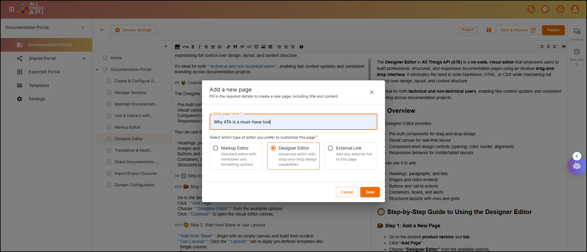
🎨 Designer Editor in the Documentation Portal
The Designer Editor in All Things API (ATA) is a no-code, visual editor that empowers users to build professional, structured, and responsive documentation pages using an intuitive drag-and-drop interface. It eliminates the need to write Markdown, HTML, or CSS while maintaining full control over design, layout, and content structure.
It’s ideal for both technical and non-technical users, enabling fast content updates and consistent branding across documentation projects.
✨ Overview
The Designer Editor provides:
- Pre-built components for drag-and-drop design
- Visual canvas for real-time layout
- Component-level design controls (spacing, color, border, alignment)
- Responsive behavior for mobile/tablet layouts
You can use it to add:
- Headings, paragraphs, and lists
- Images and video embeds
- Buttons and call-to-actions
- Containers, boxes, and alerts
- Structured layouts with rows and grids
🧭 Step-by-Step Guide to Using the Designer Editor
🧱 Step 1: Add a New Page
- Go to the desired product version and tab.
- Click on the ”+” button to “Add a new page”.
- Choose “Designer Editor” from the available options.
- Click save to open the visual editor canvas.
🎨 Step 2: Start from Blank or Use Layouts
- Start from Blank: Begin with an empty canvas and build from scratch.
- Use Layouts: Click the Layouts tab to apply pre-defined templates like:
- Single-column
- Two-column
- Grid layout
💡 Layouts are useful for maintaining visual consistency across pages.
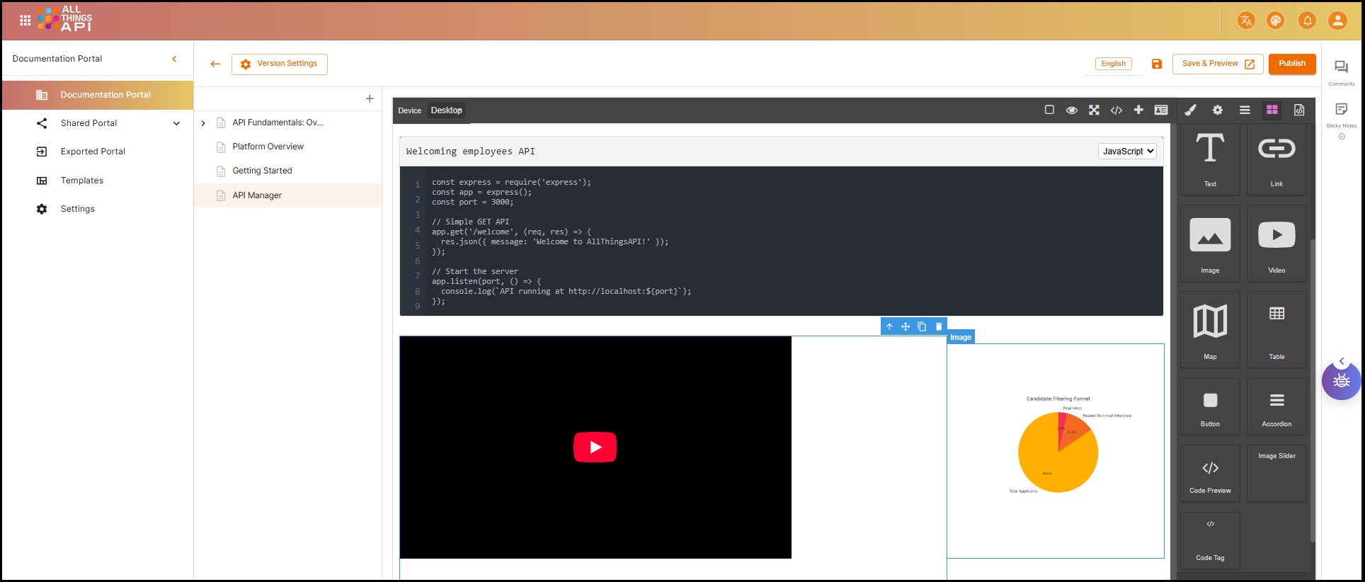
🧩 Step 3: Add Elements to the Page
Components are available on the left sidebar under the “Components” section. Drag any item onto the canvas.
🔤 1. Text Blocks (Headings, Paragraphs)
How to Use:
- Drag the Text component to the canvas.
- Double-click the placeholder text to edit.
- Select style: Heading 1, Heading 2, Paragraph.
- Customize font, color, size, and alignment from the right settings panel.
Example Use Case:
- Add a section title:
Heading: Getting Started
Paragraph: Follow the instructions below to authenticate your requests.
🖼️ 2. Images
How to Use:
- Drag the Image component.
- Click the image placeholder → Upload or paste URL.
- Adjust width, alignment, and corners in the settings.
Example Use Case:
- Insert a diagram:
Upload: /assets/flow-diagram.png
Alt Text: API Flow Diagram
Alignment: Center
🔘 3. Buttons
How to Use:
- Drag the Button component to your layout.
- Click the button to change the label.
- Add destination URL (internal or external).
- Customize style: shape, size, background color.
Example Use Case:
Label: Try the API
Link: /api-reference/authenticate
Style: Rounded, Blue background, White text
➖ 4. Dividers
How to Use:
- Drag the Divider component between sections.
- Choose solid, dotted, or dashed style.
- Set spacing above/below.
Example Use Case:
- Visually separate sections:
Divider Style: Solid
Spacing: 24px above, 16px below
📦 5. Containers / Boxes
How to Use:
- Drag a Container to group multiple elements.
- Add background color, padding, and border.
- Nest other components (text, image, button) inside.
Example Use Case:
- Highlight important content:
Background: #f5faff
Border: 1px solid #0a84ae
Padding: 20px
Content:
  - Heading: API Key Usage
  - Paragraph: Keep your API keys confidential.
🔢 6. Lists (Ordered and Unordered)
How to Use:
- Drag the List component.
- Choose bullets or numbers.
- Add items, reorder as needed.
Example Use Case:
- Steps to set up authentication:
text
1. Sign in to your developer account.
2. Go to API settings.
3. Generate an API key.
4. Use it in the Authorization header.
🎥 7. Videos / Embedded Content
How to Use:
- Drag Video or Embed component.
- Paste a YouTube/Vimeo link or iframe code.
- Adjust width, auto-play, and alignment.
Example Use Case:
text
Video URL: https://www.youtube.com/watch?v=abc123
Autoplay: Off
Width: 100%
🎛️ Step 4: Customize the Design
Click any component to access the customization panel on the right.
You can control:
- Text: Font size, line height, color
- Spacing: Padding and margins
- Colors: Background, border, text
- Alignment: Left, center, right
- Responsive Behavior: Automatically adjusts for smaller screens
Step 5: Preview the Page
- Click the Preview button (top right)
- Review how the page looks to end-users
- Confirm formatting, alignment, and flow
💾 Step 6: Save and Publish
- Click Save to store changes.
- If your documentation version is already published, the page becomes visible instantly.
- Otherwise, go to Version Settings → Publish to make the new content live.
✅ Summary
The Designer Editor in ATA enables you to create rich, responsive, and branded documentation without writing code. It’s the best choice for:
- Marketing teams writing user guides
- Product managers sharing onboarding walkthroughs
- Support teams documenting workflows
- Anyone needing fast, visual content creation
With its drag-and-drop simplicity, you can design developer-friendly pages that look polished and stay on-brand — all without writing a single line of Markdown or HTML.